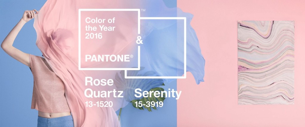
This year, Pantone has really changed it up! Not only have they lightened up the color choice from the darker, bolder ones over the past few years, this year they have chosen TWO colors. While Rose Quarts and Serenity make me think of baby shower boy vs. girl colors, it is actually the combination of the two that Pantone was going after. The mixture of the warm pink and cool blue have a very tranquil effect.
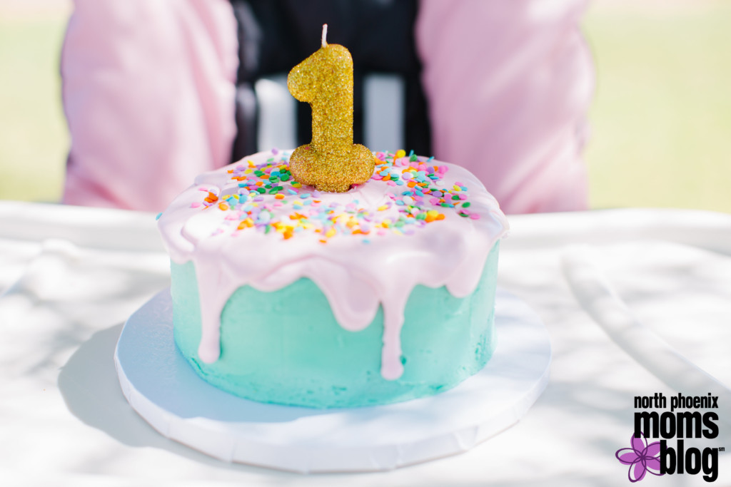
Individually, these colors are easy to add to your style and you probably already own pieces in each of these shades. I plan on incorporating what I already have into my wardrobe and home decor especially in the spring time. Here are some ideas on how to do that, including a few ways to combine the two colors.
What do you think of the color combination? Do you plan to incorporate these shades into your style? If so, how? Let us know in the comments below!


